Project Building

Project Building
300 North LaSalle, Chicago, IL

Sunday, March 11, 2012

Redo!


This week, my goal was to redesign my floor plan and get caught up as much as possible. Sadly, I am behind, but the good news is that my plan is more functional and user friendly. The new plan consists of an updated collaboration area, library, large break area that can be used for collaboration, a executive wing, and a more unique showroom.


The reception desk is the same, but the seating area is now located on the edge of the showroom. The conference rooms are generally the same, but they are now pushed up against the exterior curtain wall. I will be posting my office areas and collaboration area renderings when they are finished, so for now let's look at the break area, library, as well as the showroom (I will be updated it soon, but the renderings give the general idea of what I want for the space).


My break area consists of seating for groups and individuals. The blue wall is comprised of acoustical wallcovering, as it is next to the office area. Circular acoustical clouds will be suspended from the open ceiling to create visual interest, while lowering the noise. The flooring is a LVT (Luxury Vinyl Tile) in a citron color to add interest.


The library is very simple in design, with grand bookshelves and furniture with simplistic lines and a neutral upholstery. To add visual interest and color, I have designed suspended plastic elements. Some will be used as pendant lights, while the rest will be used for visual effect. I decided to keep the items located on the floors and walls to be neutral so that the book binding will be the focal point of the space. This creates a spacious area without too much visual clutter.
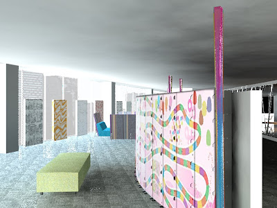

The showroom was very difficult to design as I wanted to create a fun and interactive space without being to typical and "cheesy". After much research, I came up with the idea of using interactive display panels in my showroom. These can be used for design,textile display, collaboration, etc. Next to each system, there will be textile books so that the guests can physically view and feel the material. On the outside of the space, textiles will be put on a roller belt-like system. This will create visual interest and can be changed out as needed. Large twisted-plastic columns frame the space, making it less formal and more visually appealing. I will be posting updated images of this space soon.

Stay tuned over the next few days as I will be showing my office areas, collaboration area, conference rooms, as well as the updated reception area and showroom.

Sunday, March 4, 2012

Floor Plan-Revisited

Idea 1


Idea 2


Idea 3 (the one I like the best)


This week, we had design professionals come and look at our project progress. Although my renderings were praised, my floor plan missed the mark. Therefore, my goal for this week was to revisit my floor plan and have another charette to solve my problems. Although I worked through multiple ideas, I came up with 1 cohesive plan with two alternate plans. This plan focuses more of grouping like activities, with more focus on the showroom, library, and even a focal area when you enter the space that will be used as a blank canvas to visually display seasonal themes the company has. The break area will be larger, as there will be seating inside the space instead of having it out in the open. The library is larger than the original plan, which will be nice for research, inspiration, and even meetings. The VP’s are now next to the Director for convenience and the showrooms are adjacent to these spaces. ­With these changes, I hope to create a more exciting floor plan that is visually and spatially more intriguing. What are your thoughts?

Wednesday, February 22, 2012

Come On In!


A reception area is important in a space as it is the first area a person sees when they enter into a space. My idea behind my reception area was to create a open space that relates to the showroom area, but still remain its own entity. To achieve this, I created a metal wall that separates the two spaces. Thanks to my critique on Monday, I have decided to fill different portions of this wall with colored glass. There are globe lights that lead the guest from the main entrance to the reception desk. The reception desk I have in my renderings now is not the reception desk for my final plan. My idea is to create a desk that looks like a piece of fabric is being draped over the desk (I have added a picture to show the draping affect that I wish to achieve as my drawing skills are poor). I will use a white Corian to create this facade as it is a durable product that can easily be mainipulated. It will also be a nice contrast against the colored glass and industrial metal tones. There will be a small seating area to the right of the reception desk. An idea that was brought to my attention on Monday was to create a small space within a space by inlaying carpet and lowering the ceiling. I think this is a great idea as the space is very open and this will create a unique waiting area and possibly meeting and collaboration area as well. I am still trying to figure out how to incorporate the name "Pastiche" into my reception area. One idea that was given to me was to incorporate it into the metal wall through the use of glass and manipulating the metal pieces to create letters. I am still trying to figure this out and any ideas on how to incorporate the logo are more than appreciated. My next task is to finalize the major circulation area, so stay tuned.....


Reception Area


Reception Desk Before


Reception Desk After


Draping effect through the manipulation of Corian

Saturday, February 18, 2012

Floor Plan


This week has been hectic and I'm a little behind on my project update. Yes, I finally have a floor plan that is 99% complete. I still have some furniture placement to ponder about, but since we're working on charettes for the next couple of weeks, I will hopefully fix the issues. Using the parti, I was able to create a open floor plan that incorporates the idea of group collaboration and blended interaction. I used small seating arrangements around the exterior of the space as well as open circulation to allow for interaction between different areas and departments. I have doubled my the staff as the space was WAY TOO BIG for 32 people! I am looking at various furniture vendors so that the space stays true to my concept of incorporating modern elements with traditional accents. Tomorrow I will share my reception area charette and FFE.

Wednesday, February 8, 2012

Functional Plans (aka Why Do I Have SO MUCH Space?)

Week two of ideation sketching in terms of floor plan layouts, and I have to admit that my relationship with my floor plate is turning into a healthy one, instead of one where I slowly go crazy due to all the windows and the large elevator shaft. Over the weekend, our goal was to create five functional plans and allocate space with the help of our programming document that we created last semester. I thought that this was going to be a breeze: allocate square footage, add some walls, done. The good news was that by the time I added all of my square footage, I had space left over...the bad news was that I had extra square footage by the time I was done. Hopefully, the problem will be solved when I add furniture, so fingers crossed!

Below are my five functional plans that I have created from my parti. I am leaning towards using plan 3, as I can create some interesting circulation patterns when I tweak it for my finalized floor plan for next week. I also think it will create an exciting space for occupants and guests. What are your thoughts?


FUNCTIONAL PLAN 1

FUNCTIONAL PLAN 2

FUNCTIONAL PLAN 3

FUNCTIONAL PLAN 4

FUNCTIONAL PLAN 5


Wednesday, February 1, 2012

Parti


To design a space that is memorable, it is important to use a Parti. Partis include the following:
  • Arrival-setup for the whole experience within the space
  • Paths-depicts movement throughout the space and communicates private vs. public paths
  • Nodes-niches with artwork, seats, or resting area that helps with wayfinding as nodes intersect paths
  • Centers-place of activity with a specialized, focus activity i.e., conference room, showroom
  • District (Domains)-more than one specialized focus i.e., offices
This is important in generating organizational concepts.


I personally have difficulties designing partis, so this part of the design process was quite a struggle. However, with the help of professors and friends, I have designed a parti that will help me create an inspiring and memorable space.

A major challenge with this space is the large elevator core in the center of the space. The circulation throughout the space will be a racetrack pattern. To create interest, the traditional circulation pattern is rotated to create intrigue. Districts will be on the four corners of the space, with nodes for collaboration areas and meeting rooms in between. The nodes will also help in terms of wayfinding ease. The center will be surrounding the elevator core to create excitement. Overall, I think this circulation concept will have the feeling of a fun office, with functional paths for user ease.

What are your thoughts?

Monday, January 23, 2012

Concept Statement

The concept for Pastiche will be inspired by the works of Bradbury Thompson, a 20th century graphic designer, who merged historic illustrations with modern typography. The main aspect of the space will be the blending of spaces, as seen in the blending of illustrations and CMYK colors in Thompson’s work. Geometric Shapes create order and symmetry, while the organic lines in his work will be embraced in the space to create a feeling of informality and relaxation. The use of CMYK colors will help create excitement and a modern vibrancy within the space. Repetitive typography and illustrations will exemplify a sense of movement and mimic the pace of a day in the city. The overall idea of the contrast between white space and colorful illustrations reflects the harmony and unique spirit seen in the company. This in turn will create an enriching experience for employees, clients, and various guests to the space.


With this space, it is important to consider the following:

1) location
The space is located across the street from the Mercantile Mart, meaning that there are multiple textile showrooms within a short distance. Therefore, it is important to make a bold statement and leave an impression on guests to the space. Although the space is in a modern building, the city where it lies is traditional and classic. Therefore, it is important to remember the rich history of Chicago and the traditions that make up the city.

2) How the four areas (the entrance, the showroom, the office area, and the textile development area) interact
It is important to consider not only how the areas interact as a whole, but how they interact individually as well. Each department must work together to achieve a cohesive and successful space. However, it is important for each area to be unique and have the ability to work individually as well

3) The design features within a space
With textile facilities, it is important to not only create a space that enhances the product, but sells the company's viewpoints and sense of style. The goal is to design a space that is modern, yet classic and can be seen as a company with its own style and will be able to move into the future without major changes.